Why is a Brand Moodboard Important? (+ How to Create One)
What brand moodboards are actually used for and why you should have one for your business!
For all of my brand design clients, creating a moodboard is always the first step in the project. This is becoming a standard design practice, but moodboards aren't just useful for designers like me - they're also helpful for:
Business Owners
I'll explain in a moment how the businesses I work with can use the moodboards we create during our project, but it's not just for my benefit!Bloggers
Having a moodboard for your blog can help you get clear about your design and content/photography theming - very useful!Photographers
Many photographers use moodboards as a guide for their own style and for theming photoshoots.Artists & Creatives
Again, moodboards can be used as a style guide for a number of projects!Wedding/Event Planners
For theming events and getting an idea of a style & atmosphere, moodboards are super useful!
What Is a 'brand moodboard'?
A moodboard is a collection of images (photos, graphics, textures) that together display a distinctive, cohesive theme. It is a visual tool for designers & business owners to put across their ideas for a brand's personality.
And what do I mean by a theme? Here are some elements that might make up the theme of a moodboard by having common threads throughout the images:
Colour palettes
Font choice
Textures & patterns
Photography style
Feeling/emotion
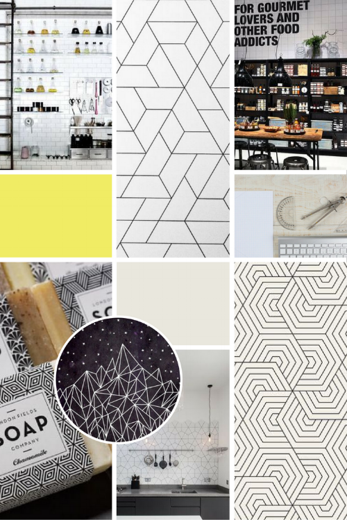
Below are some examples of my clients' moodboards:
Images via: 1 // 2 // 3 // 4 // 5 // 6 // 7 // 8
For The Cocoa Lab's brand moodboard, there was a clear preference for geometric patterns and a school paper and chalkboard feel, as well as suggestions towards a 'laboratory' theme. This matched with their desire to bring 'science' to the chocolate industry.
What do you use it for?
I use moodboards in my clients' branding projects because it gives me a clear sense of what overall theme their brand's personality is going for, and I use it as a guide when creating logos and branded collateral such as business cards, to keep me on track and ensure everything is consistent.
This is a key word here - consistency.
A moodboard is essentially a guiding light for all visual elements of your brand.
If what you are creating matches with the style of the moodboard, then you are on-brand. If it doesn't, then you need to re-evaluate whether it is right for your brand.
This is useful for me as a designer AND my clients as business owners. Having a moodboard helps everyone stay consistent in everything they create.
Business owners/bloggers/creatives/events planners etc. can also use moodboards to show third parties (ie. designers, suppliers) so that everyone is on the right track, working towards the same goal - the same moodboard.
How do you create one?
Below is how the process works for me and my design clients:
Clients fill in a brand questionnaire
My questionnaire gets the client thinking deeply about their brand & business, providing them a focus of the visual side of things. It also helps me get a deeper idea of their 'brand personality'. Read 'how to prepare for a brand or logo design'.We set up a shared Pinterest board to collect imagery
Pinterest is a great bookmarking tool that my clients can use to 'pin' (aka. save) things from around the web and on Pinterest that they feel portrays their brand.I curate the images into an overarching 'theme' (+ add more if needed)
Using their Pinterest board and questionnaire, I refine the images into a definite theme and add more of my own selection if it needs elaborating.I arrange the images in a moodboard collage template
I'll take these 'themed' images and arrange them into a collage that puts across the concept as clearly as possible.I select a colour palette from the images & add to the moodboard
From the images in the moodboard, I'll take key colours and create a palette of complimentary colours to use for the rest of the project.
But this isn't the only way to create a moodboard! In my process, we usually only work digitally, using imagery my clients find around Pinterest and the web and arranging them in a virtual moodboard; this is to keep things simple and quick for the client.
You could also collect physical things from the world around you and take photos of brands & things that you want to add to your moodboard. Or you could create a tangible moodboard in a large sketchbook or on canvas; this would allow you to add physical textures & materials to the mix. Interior designers & artists often do this!
As for actually creating the moodboard?
While it is relatively easy to create collage templates in Photoshop or InDesign, I've found Canva is the the simplest way. Canva is a free online tool that you can use for all kinds of graphics and templates, but it makes moodboards particularl simple!
STEP ONE - CREATE A DESIGN
Go into Canva and select a design shape and size (I usually go for a 'Pinterest' template as I want to be able to share my moodboards on Pinterest once they're created).
You'll then be given a blank slate to start your design!
STEP 2 - ADD A COLLAGE 'GRID'
Use the sidebar on the left-hand side to select 'Elements' and then go into the 'Grids' section. Then you can choose a collage layout to suit you and just click on it to add it to your design!
STEP 3 - UPLOAD YOUR MOODBOARD IMAGES
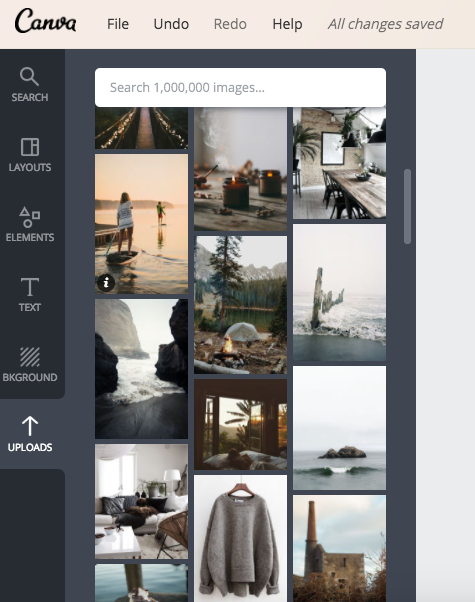
In the left sidebar click the 'uploads' button and start uploading the images you want to add to your collage. Once they've uploaded, can simply click and drag them into the box you want them to appear in (play around with the placement until you're happy!).
STEP 4 - FINISH AND DOWNLOAD
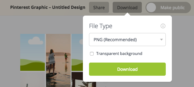
You can always add other elements like coloured circles or blocks to show the colour palette you've chosen, and then once you're done, simply click the 'Download' button in the top bar on the right, and download it as a png!


