Seeing a Brand Progression with The Cornish Life
As blogs and businesses grow, their brand vision naturally changes over time.
As some of you may know, as well as writing business & marketing focused posts here, I also have a personal, Cornish-lifestyle blog that I've been writing on for over 2 years now. Over those 2 years, the brand and vision for that blog have changed a lot, and thus over time I have tweaked the branding and website design to suit that.
You can see the subtle logo progression below:
As you can see, the changes are minimal, and (to some) may not seem important at all. But branding is much more than a logo and I have made these small tweaks in order to maintain familiarity, whilst reflecting the maturing of my overall brand.
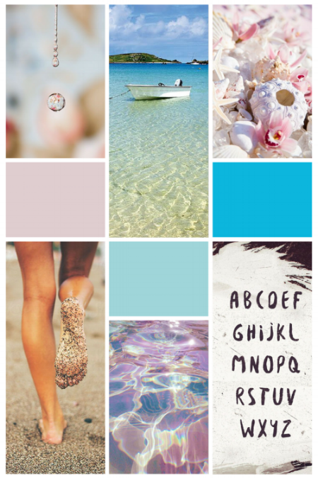
You can see more of this development by comparing the moodboard I created for The Cornish Life 18 months ago, with the current brand moodboard:
The OLd moodboard (before)
The colour palette here is very bright and quite feminine. Based on light turquoise ocean colours and seashells, and these images reflected what I wanted my brand to encompass: An up-beat, Summery, beach-loving tribute to Cornwall.
The New Brand Moodboard
Images via: 1 // 2 // 3 // 4 // 5 // 6 // 7 // 8 // 9
You can see that the choice of images and colour tones in this new moodboard are totally different to the previous one; a large change that you may not have noticed just by looking at the logo tweaks, which just highlights how 'surface level' your logo is to your brand. It just scratches the surface.
Over time, what I write about on The Cornish Life has changed, my personal style and preferences have changed and matured, and my photography/editing skills have improved and developed. The old website, colour palette and brand elements (eg. my logo & media kit) weren't reflecting this.
The New Brand Concept
I find that nowadays, I'm using my blog to document my adventures around Cornwall more - rain or shine. And Cornwall isn't always shine and glistening turquoise oceans and seashells; sometimes it is, but it's rare.
I want to use The Cornish Life to show the reality of Cornwall, and how beautiful and exciting it can be even on grey, stormy days. This is why my colours have changed to a darker, moodier palette. The imagery is outdoorsy, but in a real way, not a pretty-blue-skies-everyday way.
This is also reflected in the logo font too; I did consider updating it for this new branding project, but I do still love it and feel it reflects what I want. It's rough, edgy and hand-written, but without being too 'cutesy' or feminine.
Branded media kit update
As my blog has grown, it has gained more attention from companies and PRs wanting to work with me; another reason why it's so important to have a professional, up-to-date brand and website.
With that, my Media Kit (a PDF document with my collaboration details) needed to mature too, to reflect the quality of brands I want to work with and what they can expect from my blog.
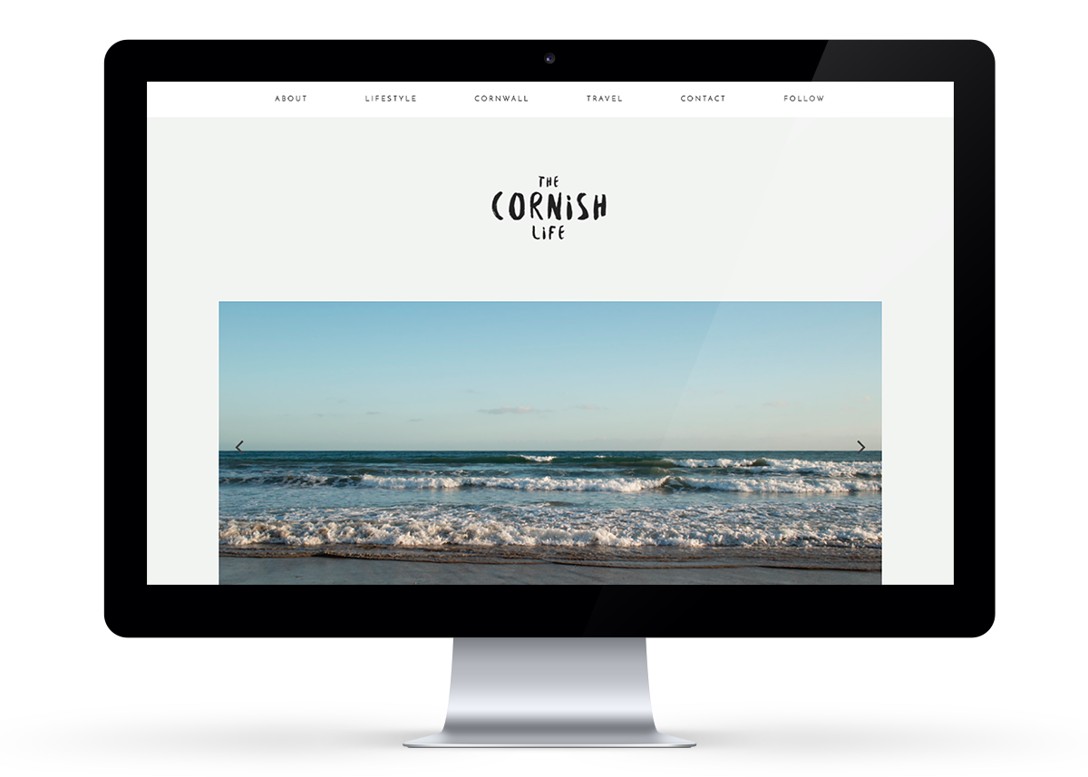
The Blog Re-Design
There was nothing inherently wrong with my old blog design; it was modern and could have been tweaked for my new colours & branding. But to me, it felt a bit 'samey' and unoriginal, and I wanted something that would feel fresh and exciting.
So along with other subtle changes and rebranding the site, the Home page got a full makeover, and I did the thing I thought I'd never do:
I got rid of my blog sidebar.
I'll be writing more about the pros and cons of having no sidebar on your blog, and how I've found it, in the next couple of weeks.
Visit The Cornish Life blog to see the design live in action.
My website is now something I can be proud of and say with full certainty that YES it 100% reflects my new brand and vision for my blog. It's minimal and clean, with moody touches and a professional layout.


