8 Things Your Website Visitors Love to See
Keep people on your website for longer with these tips!
When planning and creating a website, the most important thing to keep in mind is what your visitors will want to see and how to make them fall in love with your website (and never want to leave!).
Below are some of the top things that will please your website visitors and keep them around for longer to read more of your content:
1. Clear, non-confusing navigation
People are busy - they don't have time to get lost on your website when trying to find information! If you want to make it as easy as possible for your visitors, label your navigation pages intuitively.
For example, using page names like 'About', 'Shop' and 'Contact' is intuitive to your visitors, and they don't have to think too much about what each of them means before they click, rather than using things like 'My Journey', 'The Collections' or 'Reach Us'.
Yes, those things are more creative and fun, but it takes a little extra effort for your visitors to understand what they really mean.
2. different Options to contact you
This is so important: just having a contact form is not enough!
In fact, as of 2016, it's actually a legal requirement for you to display a contact email address somewhere on your website. But aside from that, it's just good practice to provide more than one option to contact you.
Some people hate contact forms and just won't use them, because they are too restrictive and impersonal. Some people hate phoning people, so just a phone number isn't enough either. You don't want your lack of contact options to be a barrier to people getting in touch with you - especially if you're selling services!
The best things to include on your contact page are: an email address, social media links (some people prefer to get in touch via Facebook or Twitter!), a phone number and address (if you have an office or shop etc) and a contact form.
3. 'Social proof' (Testimonials, reviews etc.)
People aren't generally risk-takers with their money; they want to make sure they are buying from a trusted, tried and tested source.
Putting their mind at ease as soon as they land on your website is the best way to nip any concerns in the bud! You can pepper your website with testimonials, include product reviews, have a list of places where your business has been featured (online, press etc).
All these things show that other people have worked with you/purchased from you and had a good experience, which makes it so much easier for your website visitors to trust you.
4. An instant explanation of what you do
There is nothing more annoying than landing on a website, scrolling down the page, and still not having a clue what the company actually does. It's frustrating, and some people won't even bother scrolling down - if they don't get the basic information instantly from your home page, they'll just leave.
Whether it's a tagline as part of your logo, the first graphic on a homepage slider, or some introduction text at the top of the page, it needs to obviously state what you do. Try to use less fancy/fluffy/descriptive words to start with (phrases like 'dynamic solution' etc. don't mean anything to your website visitors), be very clear and simple.
5. Ways to stay up to date with your news
What if people land on your website and instantly love your products or your content? That's fantastic, but you then need to make it as easy as possible to grab that initial interest and keep them coming back!
To do this, you can include newsletter sign up forms around your website, include a link for people to follow your blog on an RSS reader, or just make your social media follow buttons really clear!
6. LEGAL LEGITIMACY
Again, people want to know they can trust you, so making sure you have a privacy/cookie policy and all the other legal stuff covered can put people at ease that you're 'legit'!
Plus simple things like keeping your website up to date by regularly reviewing your content and making sure it's not outdated, and keeping the 'Copyright 2016' notice in your footer updated each year too!
I've written a full post about the legal requirements for websites, so have a read through that and make sure you're ticking the boxes.
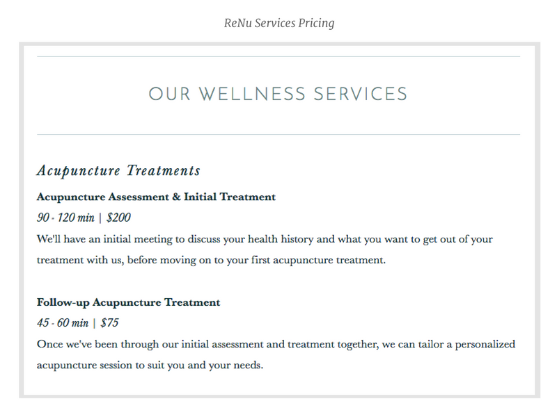
7. Services: clear pricing
If you're selling services, such as consulting, therapies, marketing etc., the first thing your website visitors are likely to want to know is how much you cost.
You may think they'll be more interested in 'the benefits your service brings to them' and how much of an expert you are etc etc., but unless you're selling an extremely high-end service where money won't be an issue, people want to know your prices first.
After all, why would they read all about you and fall in love with what you do before they even know they can afford you?
8. Products: Delivery & shipping info
Displaying a returns/exchange policy and your delivery info is a legal requirement for ecommerce websites, so this is actually a necessity!
However, I more so meant that this should be super clear and immediately obvious to your customers. Don't hide this info away in your footer! Make sure it's clear on each product page how much shipping costs and how quickly people can expect to receive the product.
On a separate delivery/shipping info page you should be including: shipping prices, shipping times, what your customers must do if they don't receive an order, a returns/exchange policy and who to contact if they want to issue a return/exchange.


