Modern, Edgy Design with Dolled Up Shoreditch (Brand & Website)
"Branding is what people say about you when you're not in the room."
When Sue contacted me about working on the branding and website for her new tanning and hair salon opening up in the heart of one of London's coolest areas - Shoreditch - I was obviously super excited! Seeing the photos of the salon being set up and the interior design ideas was great, and I'm looking forward to seeing how the branding we created looks in the form of signage when I'm next up in the big smoke.
Brand moodboard
Images via: 1 // 2 // 3 // 4 // 5 // 6 // 7
Sue has a really clear vision for the brand, led by the interior ambience of the salon and the types of clientele that would be visiting. We were inspired by all things industrial, with a 'city loft' look, as well as the hint of sexiness with the pop of pink for neon signage (a nod to Agent Provocateur and summer vibes).
Brand Concept Board
I used a combination of bold, impactful fonts and a more magazine editorial style to create a modern, fashionable look, with a bit of added personality with the handwritten 'up' that would be used in neon on the salon signage.
Using this brand concept, we moved on to create a set of business cards, social media graphics & templates, as well as a price list PDF that could be emailed to clients or printed as a flyer:
Branded Collateral
Business Cards
Facebook Graphics & Instagram Templates
PDF Price List
Launch landing page design
Once we'd finished the branding, we moved onto the website design. While the salon was still being renovated and set up, we created a landing page so that Sue and the team would be able to post updates on social media and retain interested customers with a landing pages and sign up form.
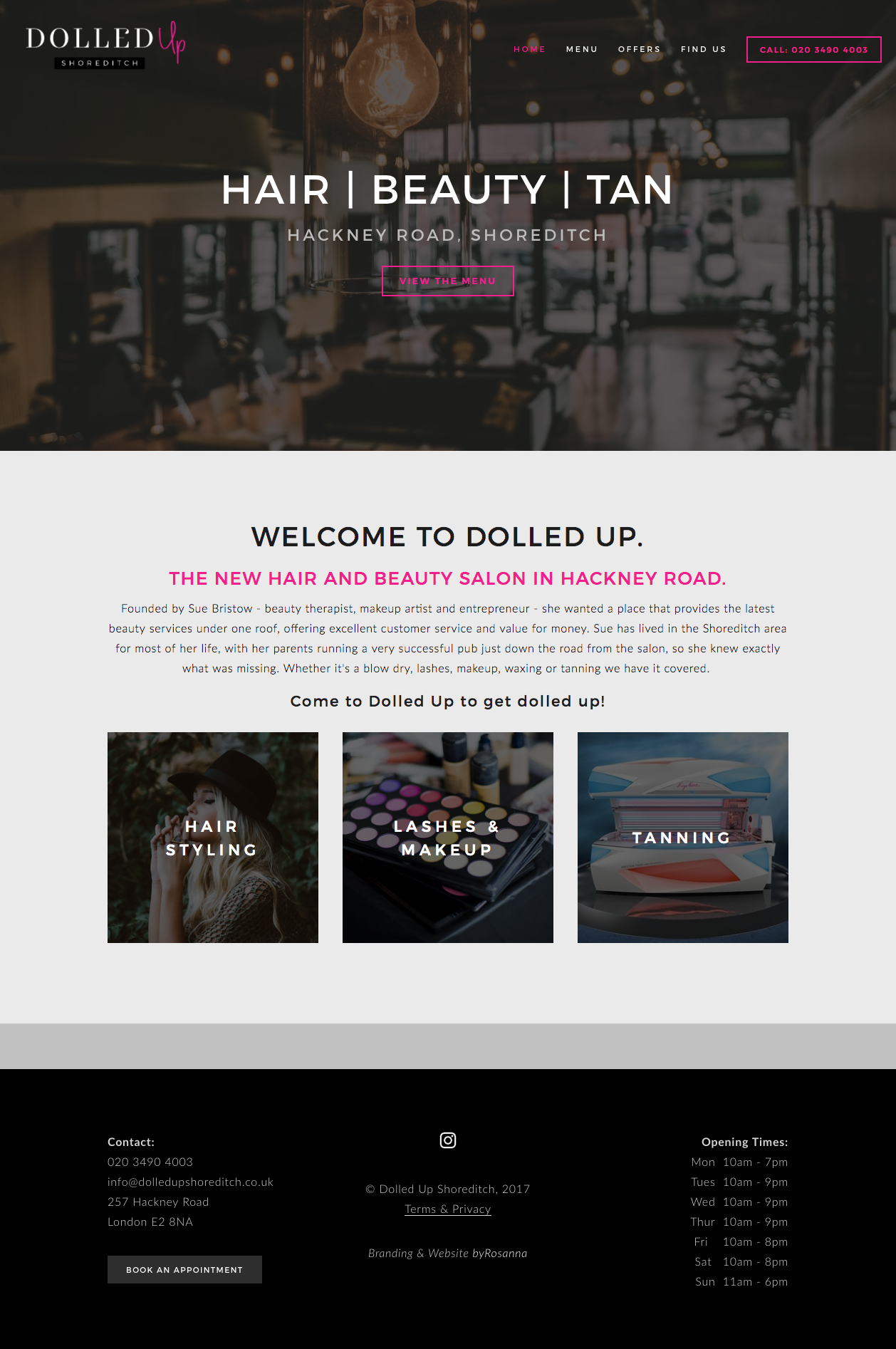
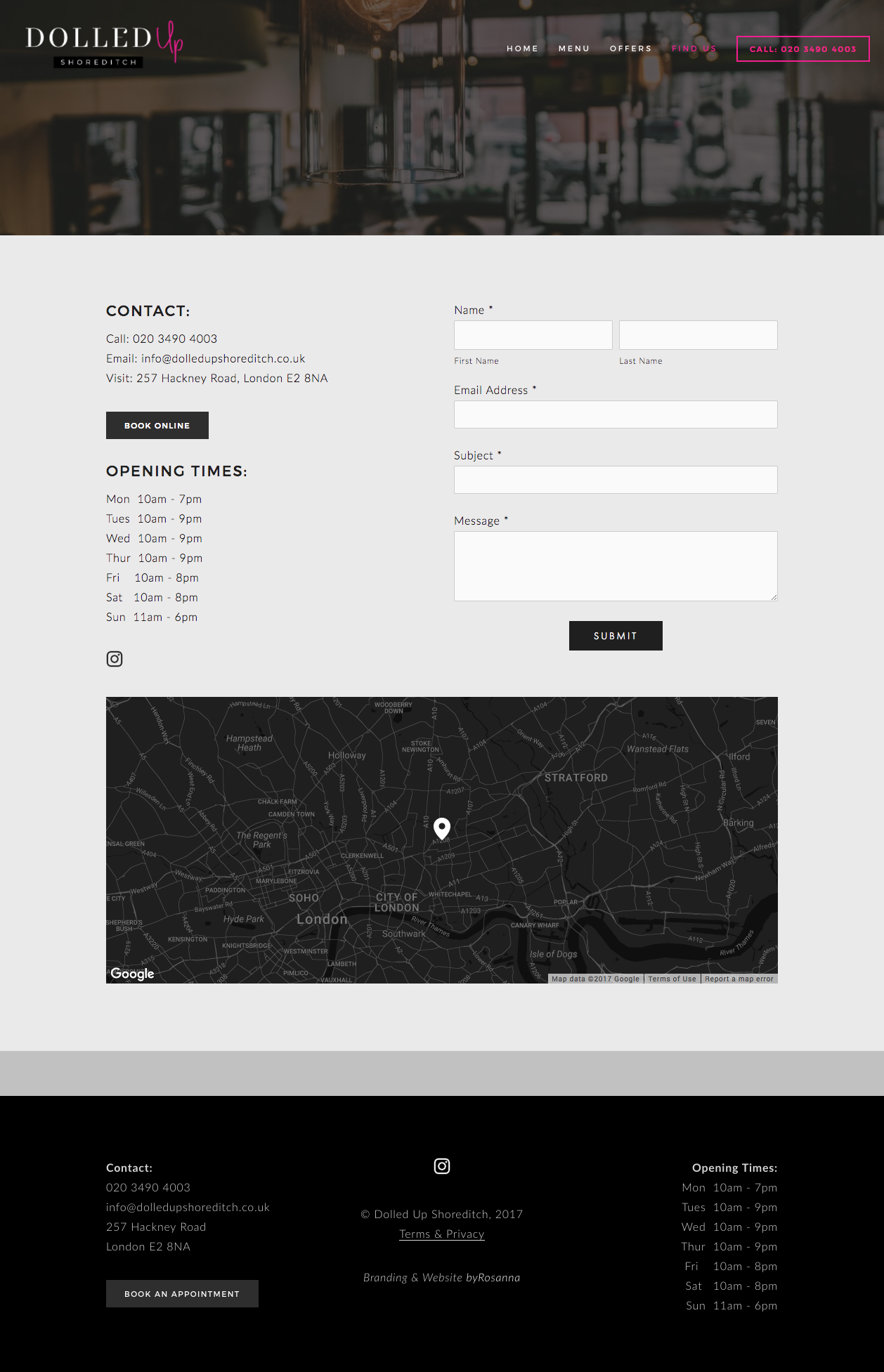
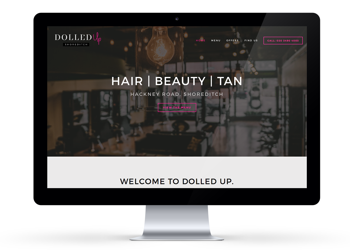
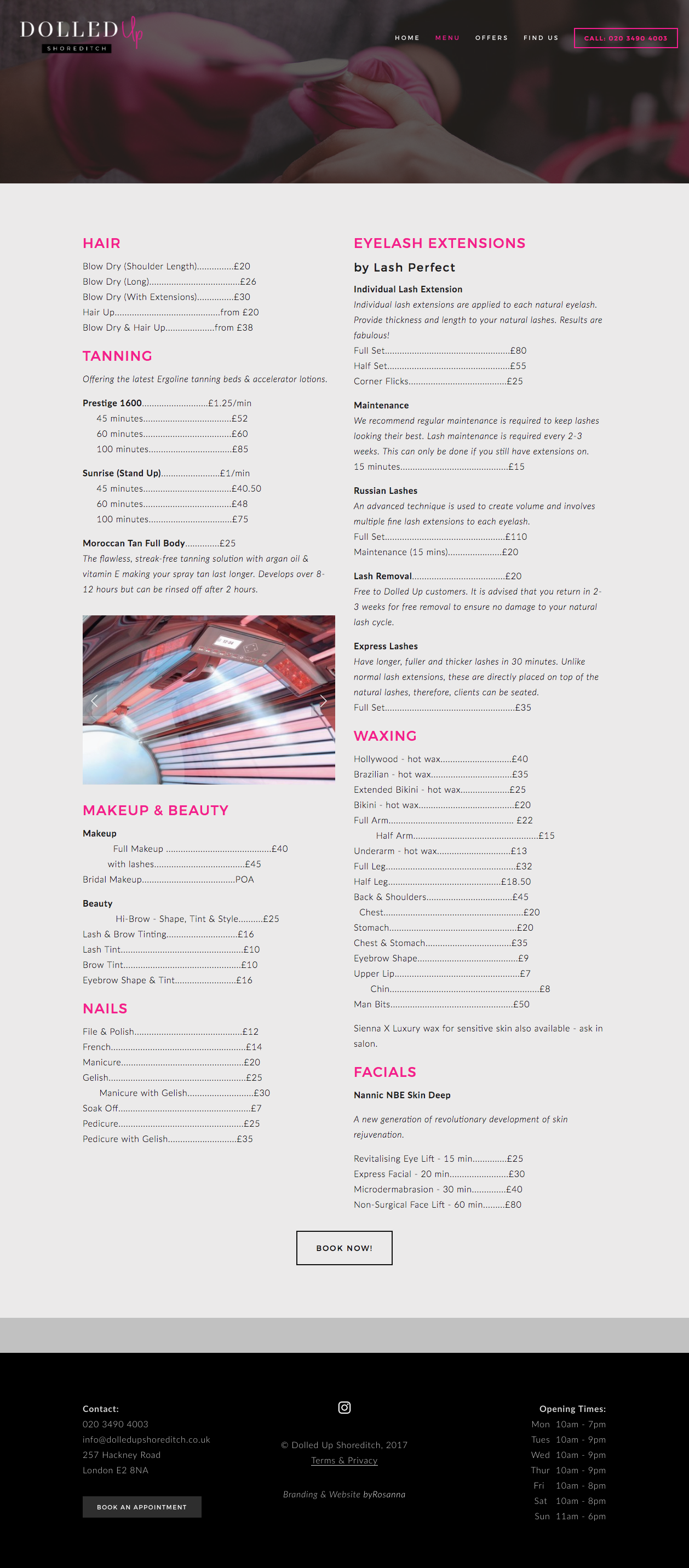
Full Website Design
Once I got the go ahead from Sue that the salon was ready to launch, I was excited to get started on the full website and truly being our branding work to life. I love how it turned out!


