A 'Hygge'-Inspired Brand Design for Embrace by Petsy Fink
A natural, Scandinavian style brand for family photographer, Petsy Fink.
Petsy has made a name for herself as a wedding and family photographer over the past few years, but wanted to launch a new project this year dedicated to a documentary style of photography for modern families. This type of 'family photojournalism' focuses on making the ordinary moments in family life extraordinary, just like like the Danish concept of 'hygge'. In each photo, Petsy aims to capture the real and raw moments of each family she works with.
As someone who also loves minimal, Scandi-style design, I was super excited about this project and Petsy and I clicked immediately.
Brand Moodboard
The moodboard we came up with was filled with beautiful green plants and natural imagery, as well as a small pop of yellow to bring in the warm sense of 'Spring' and make a connection to Petsy's wedding photography brand.
Brand Concept
We decided to pursue the stylised ampersand idea for the brand submark, due to its representing a 'group' or family unit, as well as the all-encompassed idea of 'the good, the bad and the ugly'. Its meaning is subtle, but works well alongside the core logo.
Branded collateral
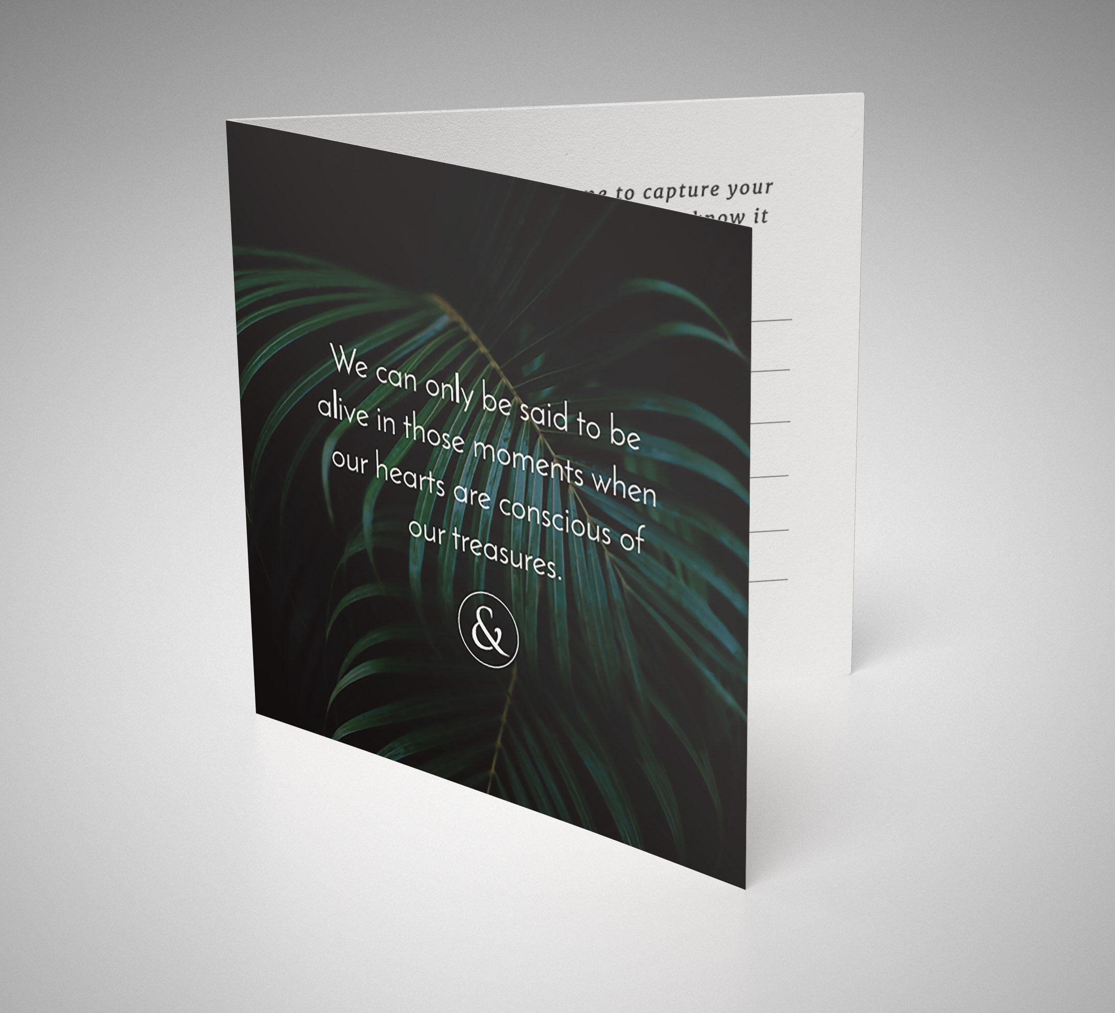
Along with stickers and USB wafer card designs, we also created a 'Thank You' card for Petsy to send to her clients, which includes a quote about treasuring moments to fit with her brand values.
I'd totally urge you to check out Petsy's beautiful new website and family portfolio, the images are stunning! I love how she has kept everything in a clean black and white, incorporating subtle hints of colour throughout.


