Choosing a Colour Palette for Your Brand
One of the first steps in my brand design process is to define a colour palette with the client.
It's one of my favourite steps!
Once we've had a Skype call or meeting, and have been through their branding worksheet, we start on the inspiration moodboard, which helps to define the overall brand colour palette.
Why do I need a brand Colour Palette?
Obviously it's very useful if you are working on a Brand or Logo Design, either on your own or with a designer, so you know which colours to focus. It's also useful for:
Designing your website
Your website designer will be very pleased with you if you're able to provide them with a colour scheme, or even HEX colour codes to use on your website! You may not think colour is an important consideration for your website, but it is; you'll need to choose colours for headings, fonts, buttons, graphics, backgrounds and colour themes for images and slideshows.Targeting your customers
By choosing your colour scheme carefully using the tips below, you can actually use it to help target your customers! Certain colours generally appeal more or less to different genders and ages, and even social class or job role.Staying consistent
I've talked before about how important is to have consistency in all your brand touchpoints (such as social media, print marketing, shop front etc), and colour plays a huge part in that as it's such a visual, recognisable element.Building awareness
The combination of a unique, well-thought-out colour palette and a great, recognisable logo and branding helps to build awareness of your business. Even if people are scrolling mindlessly through social media, or walking past a poster/billboard without paying attention, they're likely to pick up on colours and comprehend it subliminally.
How Do I choose The Right Colour palette?
1 // Consider your target audience
I highly recommend everyone go through a customer profiling exercise to better understand who you're marketing to, and once you've done that you should have a good idea of things like age, gender, location, job role, industry etc.
When we worked on Nicola Semple's new venture, How to Build Your Business Online, we knew that we wanted to appeal to a young, female, family-oriented audience.
At this point you could always do some market research to find out which colours your target audience resonate most with, what they dislike and what appeals to them.
2 // Consider your brand personality
In my client questionnaire, I always ask 'If your business were a person, what would they be like?', and offer a range of different characteristics such as 'witty', 'classy', 'friendly', 'fun', 'family-oriented', 'introverted', 'relaxed' etc.
Obviously, these traits will have a big effect on what colours will be appropriate for your branding. For example, if your brand personality is 'fun', 'family-friendly' and 'relaxed', a black and gold or monochrome colour scheme may not be appropriate. Equally, neon pink and green may not be right for an 'elegant', 'sophisticated' brand personality.
3 // Look into colour psychology
There are plenty of articles about colour psychology on the web, but it does help to understand the basics before you commit to a palette.
We knew the reader's of Roman's luxury Food & Wine blog would enjoy rich, classic tones and luxury leather elements.
For example, notice that a lot of food and drink companies have red colour schemes and branding? That could be because the colour red is said to stimulate hunger (more so than green or blue etc), apparently!
4 // Gather inspiration
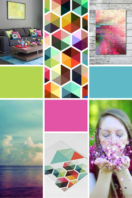
The first stage in my process after the client questionnaire and meeting is the inspiration moodboard stage. I set up a shared, private board on Pinterest for the client to pin images that resonate with them and their branding. I usually suggest they try to pin between 20 - 30 images from a range of different categories (eg, Photography, Interior Design, Art, Illustrations, Fashion); this helps me to find common themes & patterns more easily.
If you're looking for inspiration, check out some of my Pinterest boards that I've created specifically for my clients to look through!
5 // Find common themes & patterns
Once they've done their inspiration gathering, I'll go in and search for common themes and patterns to the images they've pinned. These could include colour schemes, photography styles, design elements and more.
Olivia Bossert's moodboard contained relaxed, flowing textures and blue, beachy tones, which we then reflected in her logo design!
I save all the images* and create my own moodboards with them (sometimes it'll take me a while to find the right combination of 6 - 8 images). Then I'll use an eyedropper tool or colour picker extension/app to find a range of colours from within those images.
*Remember to always include an image credit and link back to the original source of each source wherever you display your final moodboard!
6 // Look into colour theory
Once I've found a range of colours that are a theme throughout all the inspiration images, I'll create a palette from these. But it's not as simple as mushing them all together; I'll usually apply some colour theory to the mix.
If you're interested in understanding colour theories, I recommend playing around with the Adobe Kuler tool! It's web-based, and free, and is a great way to find out about different colour combinations that work well together.


