Call to Actions: What Are They & How to Use Them
Tell your website visitors exactly what you want from them with CTAs!
It's a buzzword you may or may not have heard of before, but 'Call to Actions' (aka CTAs) are in fact one of the most important elements of any website or web page. Without them, your website is simply a list of information with no obvious 'next steps' for your visitors.
So what are 'Call To Actions'?
Much like the name suggests, a Call to Action is an element on a web page (such as a button, text or image) that tells the reader what they should do next. If you want your website visitors to engage more with your brand by contacting you, signing up for a newsletter, downloading a PDF or viewing your portfolio, then you need clear CTAs on your website.
Below are some examples of Call to Actions on my clients' websites:
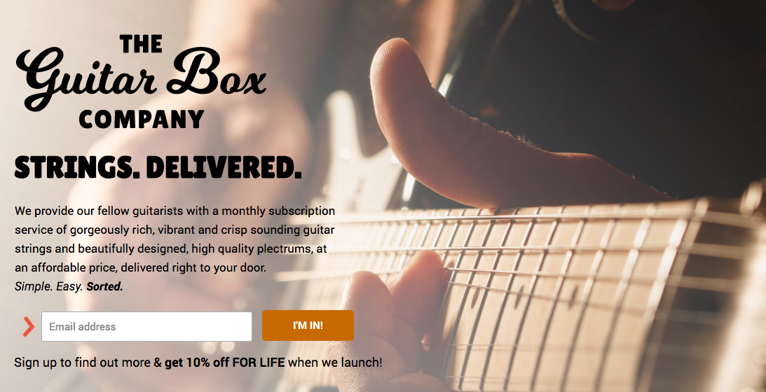
^ On the Guitar Box Company website, the Call to Action (email sign up) is right at the top of the page, because their top goal is to collect email addresses of interested customers.
^ On JoAnn Pantoja's website, we are on her 'Coaching' page, and the first thing you see is a Call to Action to book. Then as you scroll down there is more information and another CTA at the botton of the page to 'Book' as well.
When Might you want to use a call to action?
As you can see, a Call to Action doesn't have to be 'salesy'; sometimes they are simply used to direct people around your website and be helpful. You might want to use CTAs for a number of reasons:
To create a clear journey around your website
I've written before about creating user journeys for your website, but the key is to make it clear & simple for your site visitors to explore your site. For example, after people have looked through my portfolio, I want them to go to my Services page so they can see how I might be able to help them. Therefore, at the end of each portfolio item I add a button to 'View My Services' which takes them directly there.
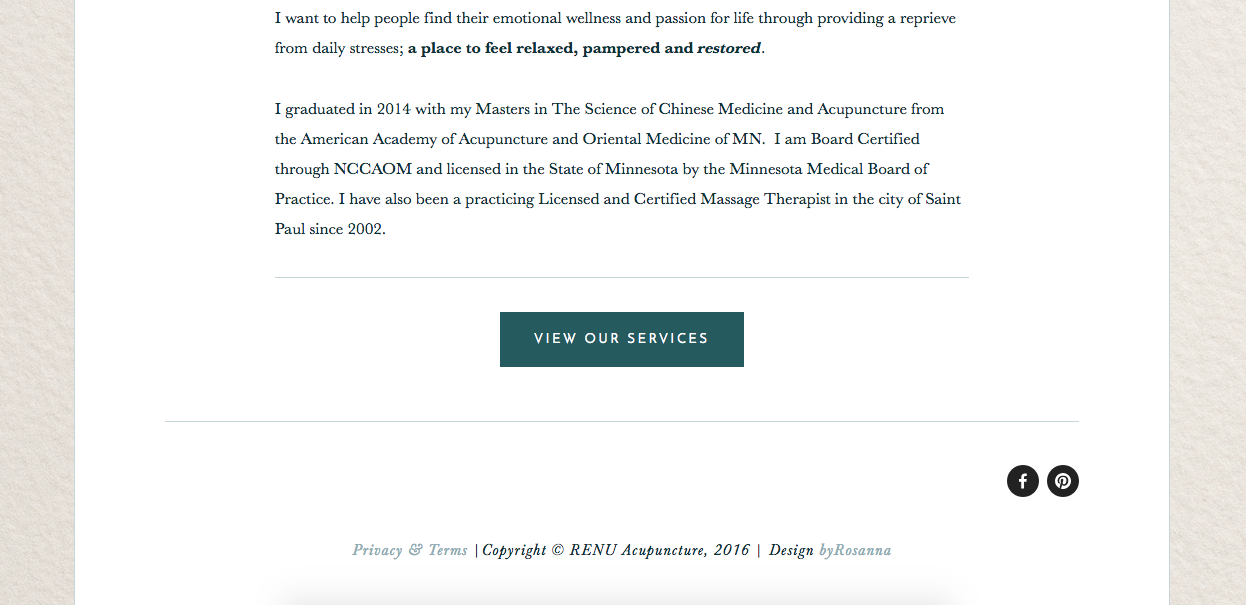
^ On the ReNu 'About' page, we added a button at the end to show people where they should go next
To provide people with information in the clearest way possible
Your website should always be the perfect blend of consistent branding & design, with necessary information. To keep things clean and minimal, sometimes you'll need to strip back the content to the bare essentials, but what if people need more? You could create a separate page on your website, or even a downloadable PDF that contains more in-depth information on a certain topic, and provide a CTA for people who want to know more.
^ Also on the ReNu website, we kept each page minimal by adding extra information to a separate FAQ page. This was linked to directly underneath the service listings on the 'Services' page.
To encourage people to contact you
For any service-based business, the goal of your website is probably to get people to contact and hire you! So it's important to have CTAs on your website giving your visitors little nudges and reminders to do this. There's no harm in adding a CTA for this purpose on all pages of your website, as long as it doesn't come across as desperate or too pushy (see tips below).
^ On the MSP Crashpad 347 site, we added a clear 'Get in touch' Call to Action which appeared just above the footer on every page, making it clear exactly what the website's purpose is.
To encourage people to purchase from you
If you're running an online shop, or are selling a specific product, then of course you want to encourage people to hit 'Buy'! Placing buttons or links to your shop around your site is a great way to direct people to the focus of your site. Depending on the abilities of your website, you could also go one step further and add 'featured product' sections on different pages of your website, with direct 'BUY' buttons there.
^ Featured shop section on the All The Frenchies home page
To get people to sign up to your mailing list
These days it's all about building your email list! It's super important to have a base of interested potential customers that you're able to update with news and marketing materials. But you need to motivate people to sign up in the first place! I've written about building lists with opt-in freebies before, but placing regular CTAs is very important too.
^ On the Jewelbox Cornwall site we put the email sign up CTA right at the top of the home page to encourage people to sign up and make a purchase with their 10% discount code.
To get people to trial a product
Software companies do this all the time; knowing that the best way to convert website visitors into paying customers is to get them to test the product out for themselves. Due to the high conversion of this strategy, clear CTAs around your website are super important!
^ On Packet Ship's website we added a CTA to the bottom of every service page to encourage people to trial the software first.
To ask people to follow you on social media
This may not be your number one goal on your website, but it's still a valid Call to Action. Many people put social media links in their blog sidebar or within blog posts as they want blog readers to have a way of following their updates.
^ On the Pompous Peasant blog, we put the social media follow buttons at the top of the sidebar to encourage people to get notifications from the blog updates.
To get people to comment or share your blog posts
Similarly, if you want more engagement and traffic to your blog posts, you'll probably want people to comment and share your articles. So ask them to! Just adding a sentence at the end with a Call to Action can remind people to do this.
^ At the end of each blog post on The Cornish Life, there are share buttons to encourage readers to share the article with their friends.
Tips for the most effective CTAs:
Prioritise & don't over-stuff
It's good to have at least one Call to Action on each page of your website, and in fact it's often necessary to have more than one, especially on long scrolling pages with several different sections.
But this is where prioritisation comes in; if your number one main goal is for people to see exactly what services you offer, put this CTA at the top of your Home page, directing people to go straight there. Your secondary goal might be to have people learn more about your company, or to sign up to your newsletter, in which case put this in a section below your first Call to Action, and add a button or link there.
^ As you can see on my own Home page, I have prioritised my Call to Actions at the top of my website to lead people to my services, and my secondary CTA on the Home page is for them to 'View my Portfolio'.
The main goal is to make it more clear to your visitors what you want them to do, not to overwhelm them with options and leave them unsure which step to take next.
Make it bold but add whitespace too
You want your Call to Actions to be clear and obvious, which is why coloured buttons always work so well! However, to avoid overwhelm and keep your design aesthetically pleasing, whitespace is really important - it also helps draw the eye to the focal point point, ie. your CTA!
^ It's very clear what the next step is after reading Jewelbox Cornwall's 'About' page; no distractions, just clear directions!
Use Dynamic verbs and/or urgency
Using verbs in your Call to Actions makes it seem more dynamic and interesting that just writing the destination of your link or button (eg. 'Services', 'About Me'). Think 'Find out more' or 'Get to know me' etc.
This is even more important with newsletter sign up forms, because you actually want the visitor to hand over something as an exchange. You really have to motivate them to give you that email address! Instead of the boring 'Subscribe' button, try 'Sign me up!' or 'Yes please!' or 'Let's do this!'. Something active and encouraging goes a long way.


